The libraries gallery
Every component library on the same sample form, in any colour, light or dark.
Libraries in the sidebar shows every component library on the same sample form, so you can choose one by seeing it, not by reading about it. A library sets the character of a form's inputs, choices, buttons, cards and progress. See Design and themes for how to apply one.
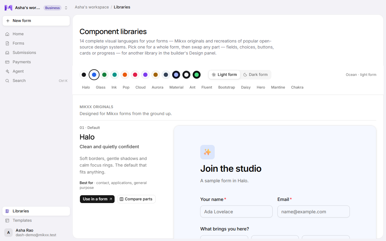
The libraries
| Group | Libraries |
|---|---|
| Mikxx originals, designed for Mikxx forms | Halo (the default), Glass, Ink, Pop, Cloud, Aurora |
| Inspired by open source, recreations of popular design systems' looks | Material, Ant, Fluent, Bootstrap, Daisy, Hero, Mantine, Chakra |
Each one shows its name, its character in a line, what it's best for, and a live sample form. The inspired ones link to the design system they follow.
Try it your way
- Colour: pick a colour preset from the row of swatches; every sample follows it.
- Light form or Dark form: see each library on a light or a dark page.
- Jump to one: click a library's name under the swatches.
- Compare parts: shows that library's fields, choices, buttons, cards and progress side by side instead of the sample form.
- Use in a form: opens the agent, so you can ask for a form in that library.
Good to know
- A form can mix libraries part by part: say Material fields with Pop buttons. Set this in the builder's Design panel.
- Colours stay readable in every library; an accent too close to the background is adjusted for you.