Design and themes
Every design option: colours, libraries, fonts, backdrops, progress, layout and screens.
Every form's look is set in one place: Design, in the builder's dock (the palette icon). The panel opens beside the page, and the page restyles as you choose, so what you see on the canvas is what people get. Nothing needs saving: each change saves on its own, and Undo takes it back.
How designing works
- Start from a look. Forms the agent builds already have one, picked for their kind (orders, bookings, sign-ups, feedback). A new blank form starts plain.
- Set the character with a component library and a colour preset.
- Adjust the details: type, corners, spacing, backdrop, header, layout and screens.
- Check it. Click Preview to answer the form as a respondent would.
Reset at the top of the panel takes every design setting back to the default. On a live form, design changes reach respondents when you Publish changes, like any other edit. See Versions.
The panel's sections, top to bottom:
| Section | What it sets |
|---|---|
| App | Apps only: whether customers sign in first. |
| Payments | Whether the form takes money, and how. See Payments. |
| Component library | The style of inputs, choices, buttons, cards and progress. |
| Colours | The accent and the background. |
| Typography | The font. |
| Shape & spacing | Corners, spacing and the backdrop. |
| Header | Alignment, icon and cover picture. |
| Progress | How multi-screen forms show how far along people are. |
| Layout | Centred or split page, question style, width, button style. |
| Screens | The welcome and thank-you screens, and button text. |
Component library
A library sets the character of every control: inputs, choices, buttons, surfaces (cards and panels) and progress. Pick one for the whole form, or mix them part by part (Pop buttons with Halo inputs, say). Each part can also stay on the form's main library.
| Library | Character |
|---|---|
| Halo (default) | Clean and quietly confident |
| Glass | Frosted, layered, luminous. Looks best over a gradient backdrop or a picture. |
| Ink | Editorial and precise. Suits square corners and a serif font. |
| Pop | Bold and playful |
| Cloud | Soft and friendly |
| Aurora | Glowing gradients |
| Material | Tonal, tactile, familiar |
| Ant | Crisp and efficient |
| Fluent | Layered and composed |
| Bootstrap | Classic and dependable |
| Daisy | Bold and cheerful |
| Hero | Smooth and modern |
| Mantine | Neat and balanced |
| Chakra | Friendly and accessible |
See every library on the same sample form in the libraries gallery.
Colours
| Setting | What it does |
|---|---|
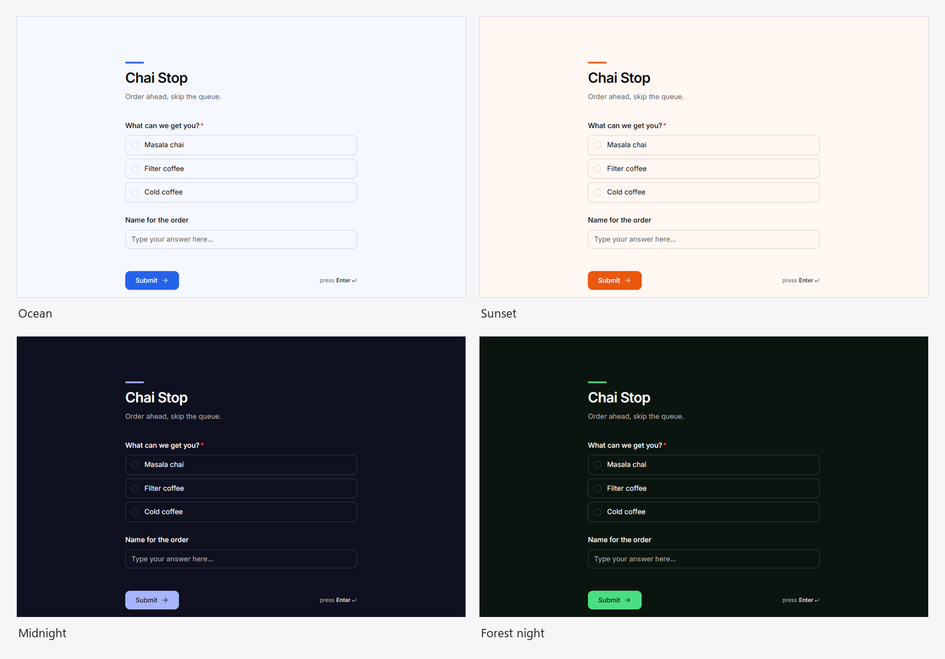
| Colour presets | Twelve ready pairs of accent and background: Mono, Ocean, Forest, Mint, Sunset, Rose, Grape, Sand, Slate, and three dark ones, Midnight, Graphite and Forest night. |
| Accent | Buttons, selected answers, focus rings, the progress indicator and the accent bar. |
| Background | The page behind the questions. Text switches to light on a dark background. |
Colours are kept readable: an accent too close to the background, or text that would be hard to read on it, is adjusted for you when the form is saved.
Typography
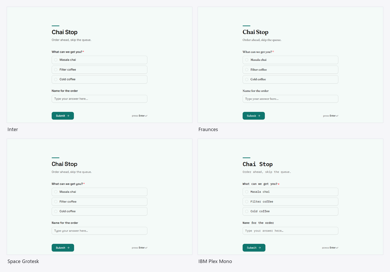
Font, ten to choose from:
| Kind | Fonts |
|---|---|
| Sans | Inter, Manrope, DM Sans, Nunito |
| Display | Outfit, Space Grotesk |
| Serif | Fraunces, Lora, Playfair Display |
| Mono | IBM Plex Mono |
The font applies to the whole form: title, questions, answers and buttons. Without a choice, forms use the default sans, and apps use Manrope.
Shape and spacing
| Setting | Choices | What it does |
|---|---|---|
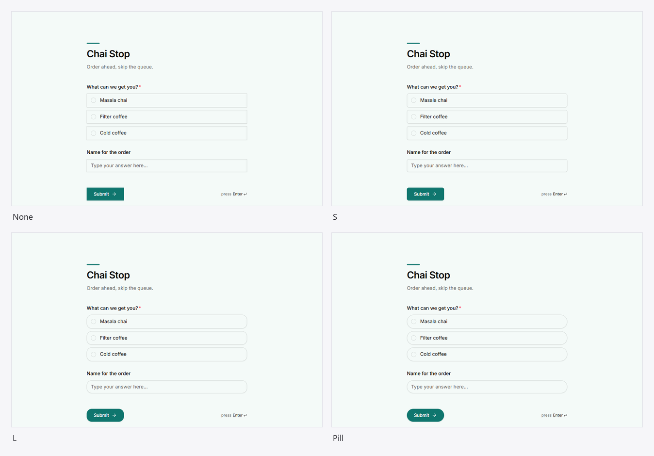
| Corners | None, S, M, L, Pill | How round inputs, answers and buttons are. Pill makes them fully round. |
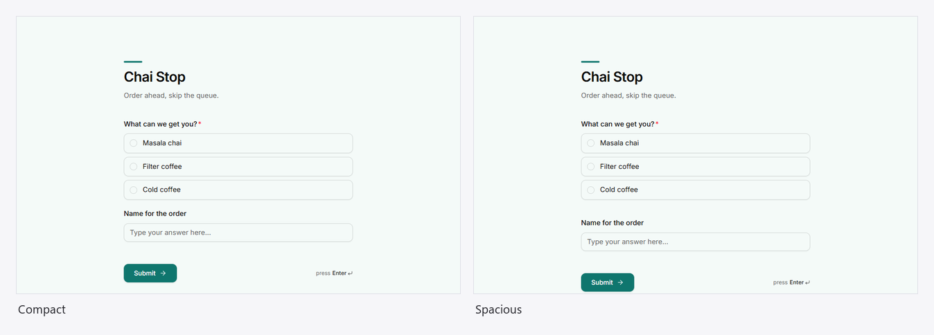
| Spacing | Compact, Comfortable, Spacious | The room between questions. |
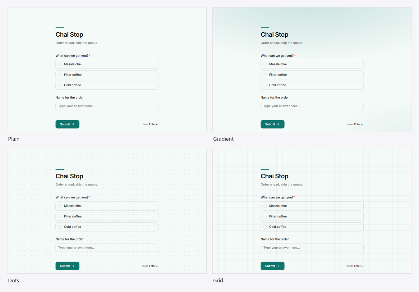
| Backdrop | Plain, Gradient, Dots, Grid | A texture behind the form, drawn from your colours. |
Backdrops
| Backdrop | Looks like |
|---|---|
| Plain | Just the background colour. |
| Gradient | A soft wash of your accent colour from the top, fading out. |
| Dots | A fine dot grid. |
| Grid | Faint graph-paper lines. |
Patterns are drawn in the text colour at low strength, so they stay subtle on light and dark backgrounds alike. On a split page with no picture, the backdrop also patterns the side panel.
Header
The top of the form, above the first question.
| Setting | What it does |
|---|---|
| Alignment | Left or Center for the title and description. |
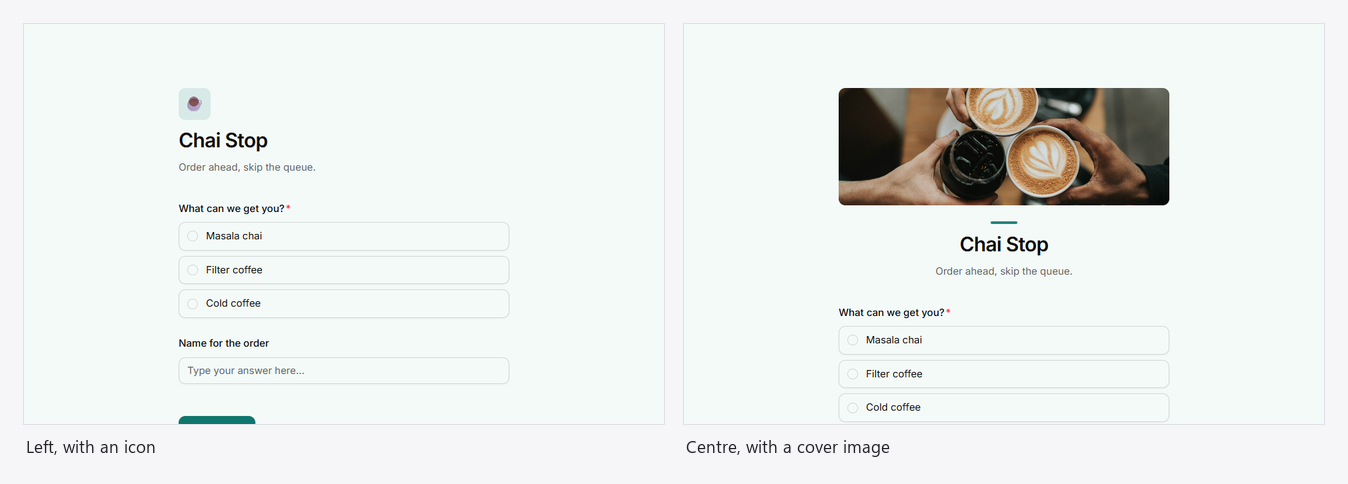
| Header icon | An emoji or icon in a soft tile above the title. Without one, a short accent bar sits there. |
| Cover image | A wide picture across the top. Upload one, or paste an https link. |
Progress
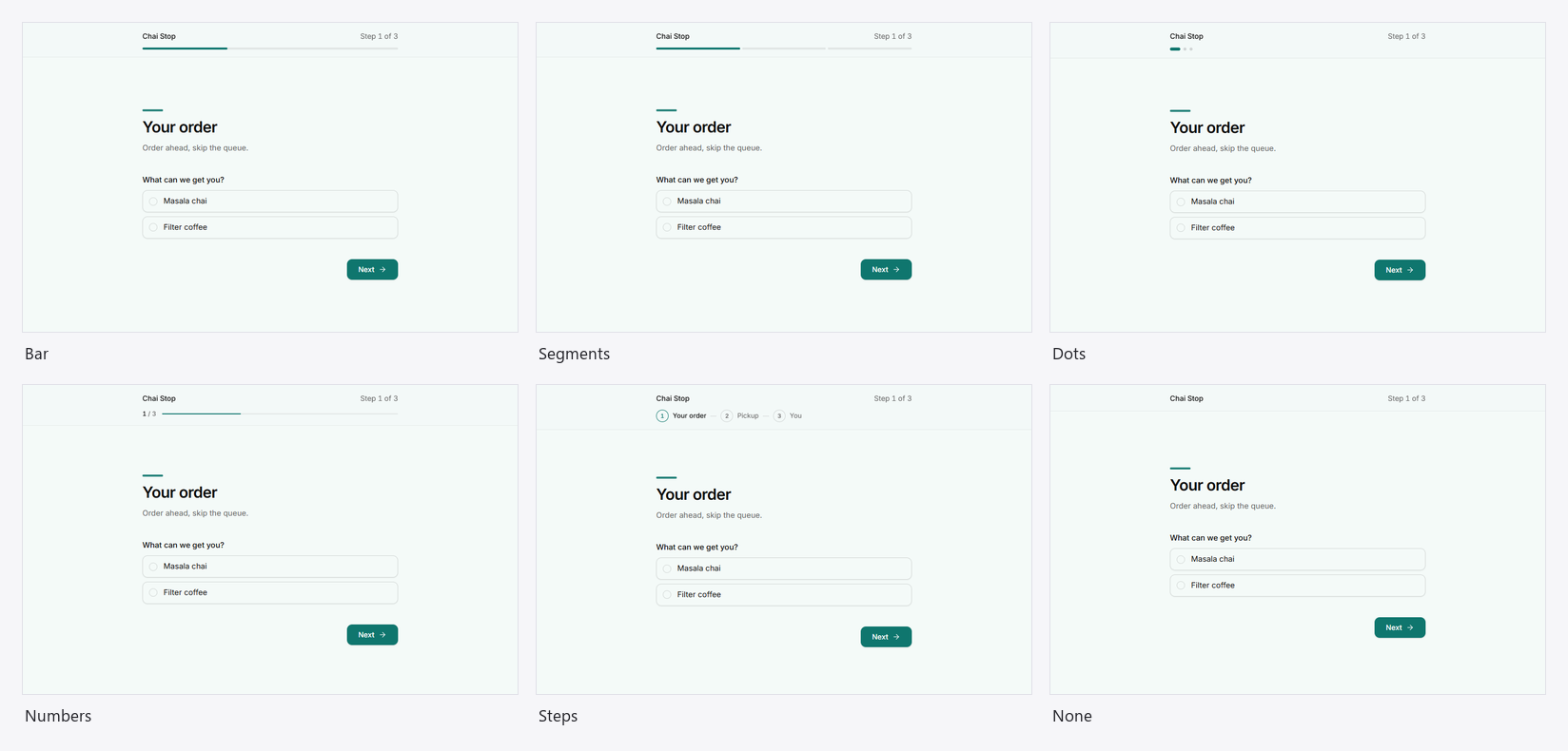
Multi-screen forms (One question at a time and Multi-step) show how far along people are. On a single-page form these settings are greyed out.
| Style | Looks like |
|---|---|
| Bar | One line that fills up. |
| Segments | One short bar per screen. |
| Dots | A dot per screen. |
| Numbers | "1 / 3" with a bar. |
| Steps | Each step's name, numbered. One-question forms show segments instead. |
| None | No indicator. |
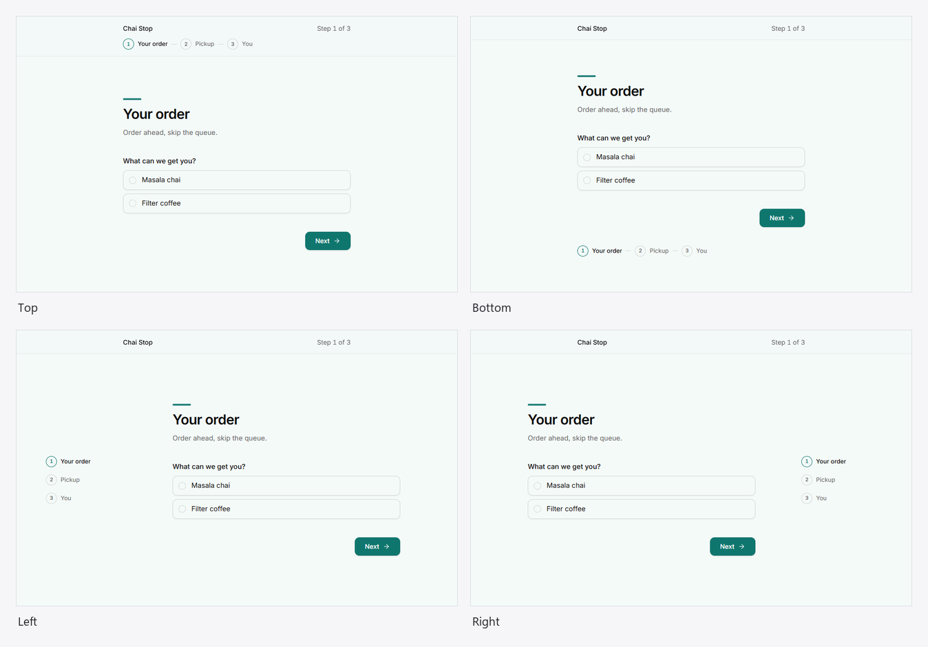
Position: Top, Bottom, Left or Right. Left and right become a rail beside the questions on wide screens, and move to the top on phones.
Layout
| Setting | Choices | What it does |
|---|---|---|
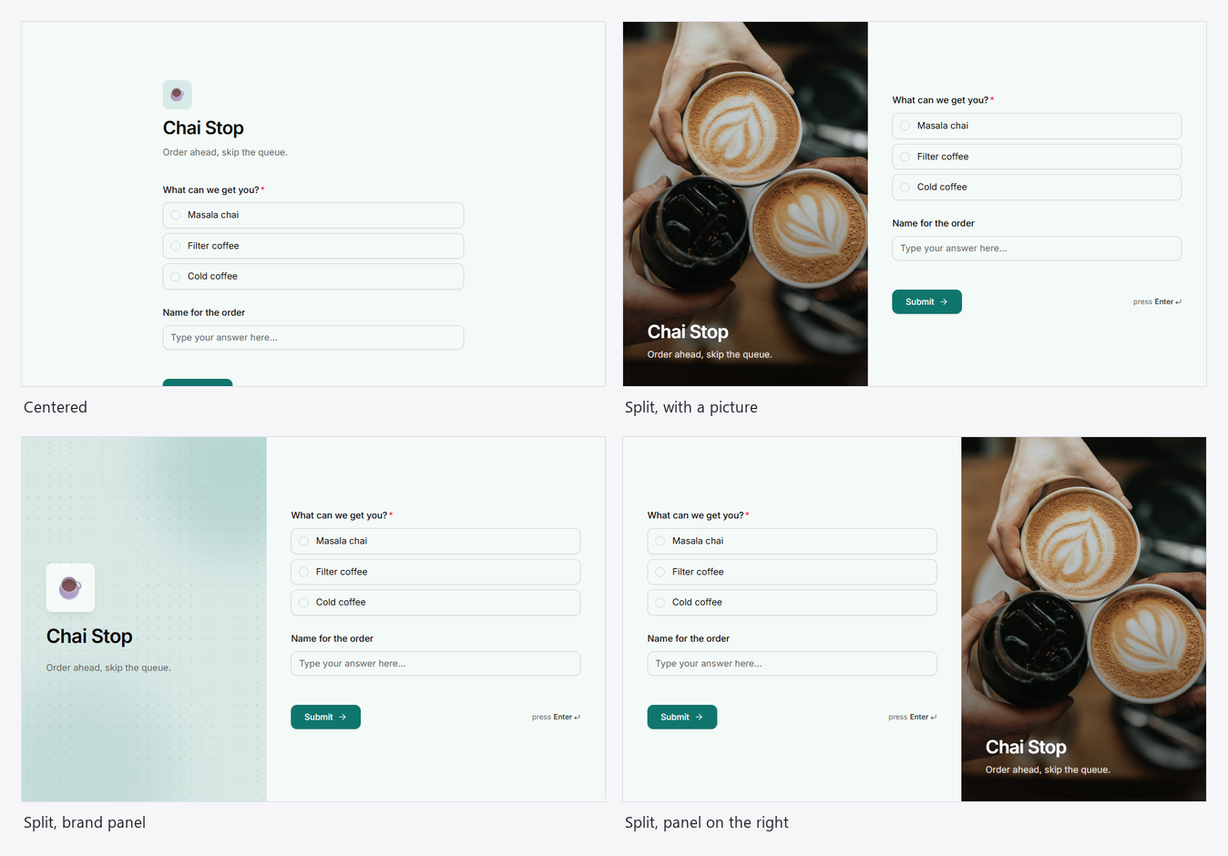
| Page | Centered, Split | Questions in the middle of the page, or beside a side panel. See Split-screen and fullscreen forms. |
| Panel side | Left, Right | Split only: which side the panel is on. |
| Panel image | Upload, or an https link | Split only: a picture filling the panel. Without one, the panel uses your colours, backdrop and header icon. |
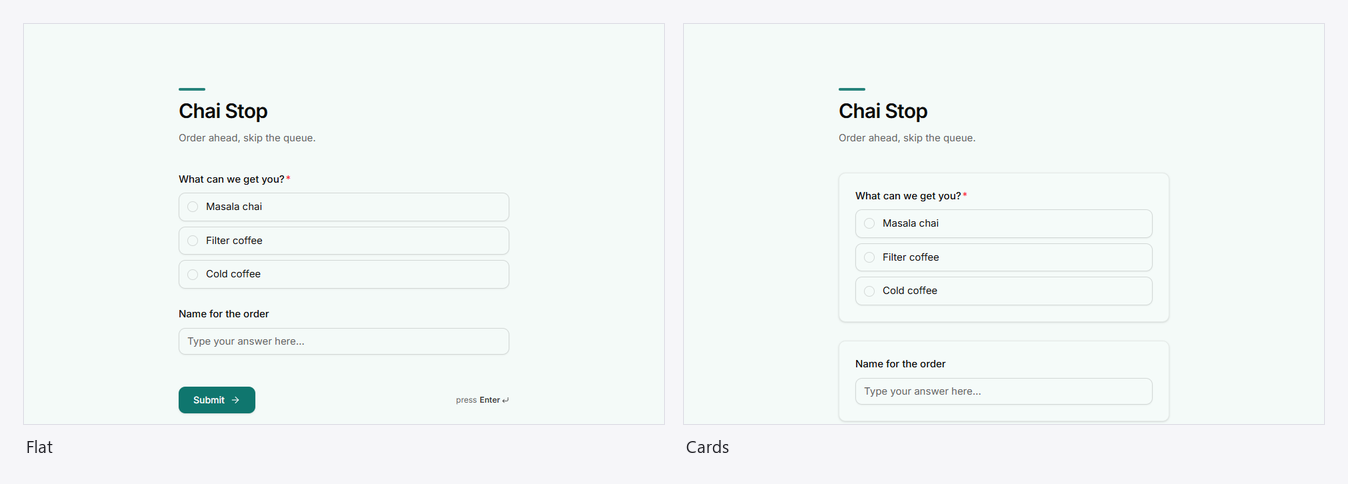
| Questions | Flat, Cards | Questions straight on the page, or each on its own raised card. |
| Form width | Narrow, Medium, Wide | How wide the questions run. |
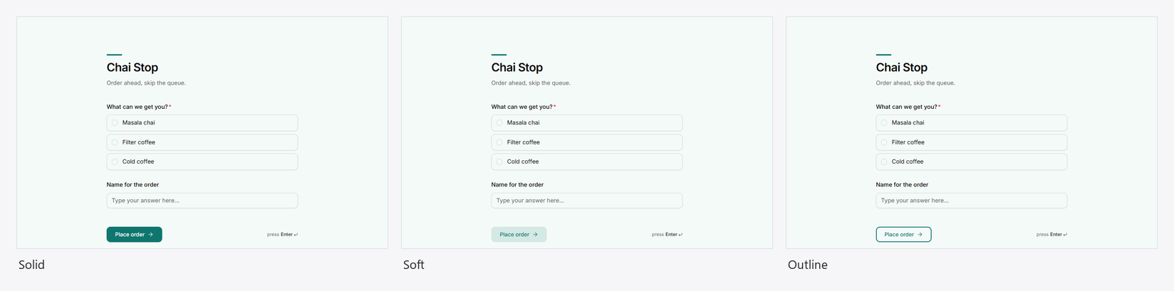
| Buttons | Solid, Soft, Outline | The look of the main button. |
Screens
Welcome
Multi-screen forms can open on a welcome screen. One-question-at-a-time forms always do; multi-step forms do once you pick a style.
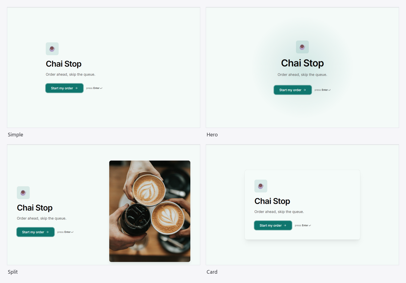
| Style | Looks like |
|---|---|
| Simple | The title, description and Start button. |
| Hero | Larger and centred, with a soft glow of your accent. |
| Split | The words on one side, a picture on the other. |
| Card | Everything on a raised card. |
Welcome image fills the picture area of Hero and Split (upload one, or paste an https link). On a split page the side panel already shows the picture, so the welcome stays simple: "Ready when you are", the number of questions and about how long they take.
Button text
Start text and Submit text replace "Start" and "Submit" with your own words, up to 30 characters ("Start my order", "Book my class").
Thank you
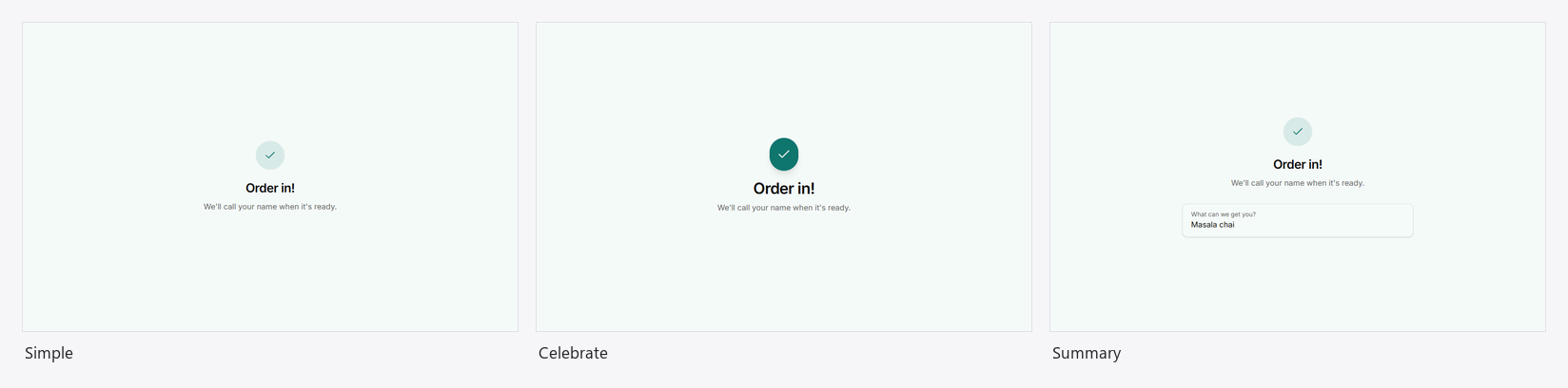
| Style | Looks like |
|---|---|
| Simple | A tick, your title and message. |
| Celebrate | The same, with a short burst of confetti. |
| Summary | The title and message, then the answers they gave. |
Title (up to 80 characters) and Message (up to 300) replace "Thanks!" and "Your response has been recorded."
Ask the agent instead
Every option here can also be set by asking: "make it dark", "use a serif", "split screen with this photo", "progress as steps on the left", "pill buttons". The agent changes only what you name, and the page restyles in the preview before you apply it.
Good to know
- Pictures (panel, cover, welcome, image blocks): click Upload beside the box to add one
from your computer or phone (PNG, JPEG, WebP, GIF or AVIF, up to 5 MB; up to 200 MB of pictures
per workspace), or paste a link to an image hosted elsewhere, starting with
https://. Uploaded pictures are public to anyone with the form's link, like the form itself. A picture that fails to load is left out, never shown broken. - Forms the agent builds start from a design recipe for their kind (bookings, sign-ups, feedback, orders), filling only what you or the agent didn't choose.
- Apps have their own look (splash, cards, cart); colours, font and library still apply. See Mini apps.